Quick answer: with a DIY tooth gem kit, the best placements are often the simplest: a discreet gem on a canine, a small composition on a visible incisor, a balanced duo or a mini constellation. The goal is to choose a design that fits the smile, is easy to place and matches the kit’s difficulty level.
This guide shares simple and more creative placement ideas, with advice to avoid overloaded compositions.
Summary
- Choosing a visible but comfortable area
- Simple placement with one gem
- Two-tooth-gem design
- Mini constellation
- Shapes: heart, star, butterfly, navette
- Balance and symmetry
- Mistakes to avoid with a DIY kit
- Checklist before application
- FAQ
Choosing a visible but comfortable area
Dental jewelry placement should be planned according to smile visibility, tooth shape and comfort. An area too close to the edge of the tooth can be more exposed to impact or friction.
For a first DIY application, it is better to choose an area that is easy to see, easy to isolate and accessible enough to work cleanly.
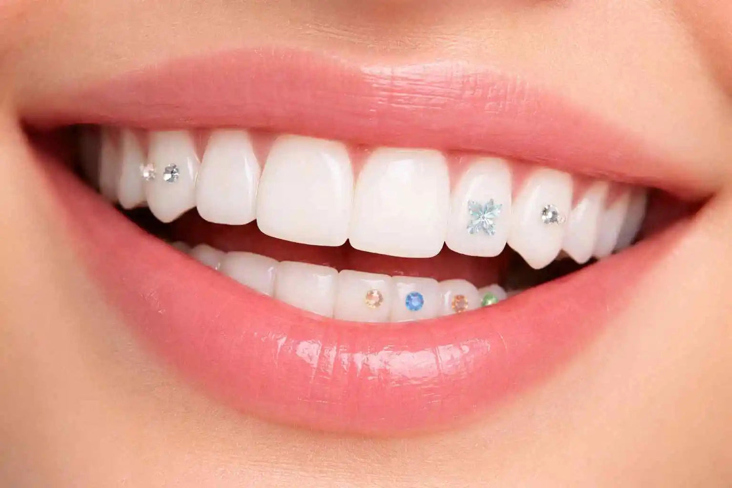
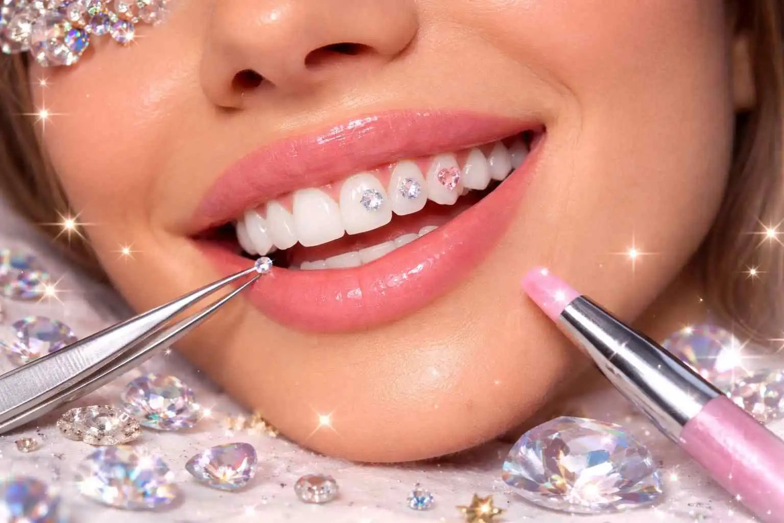
Simple placement with one gem
The simplest placement is one tooth gem on a visible canine or incisor. This design is discreet, bright and usually easier to achieve than a complex composition.
- Ideal for a first application.
- Minimal and clean result.
- Less risk of visual imbalance.
- Easy to pair with a natural look.
Two-tooth-gem design
A duo gives a more visible effect while remaining elegant. It can be placed on the same tooth or on two nearby teeth, depending on the smile and desired result.
To keep the result harmonious, control the spacing between the jewels and avoid placements that are too scattered.
Mini constellation
A mini constellation combines several small gems in different sizes. It gives a more detailed effect but requires more precision.
This type of design is better once the basics are understood: preparation, product quantity, placement and final check.
Shapes: heart, star, butterfly, navette
Shapes add personality to the smile. A star gives a celestial effect, a heart creates a softer look, a navette gives a more graphic result and a butterfly brings a trendy inspiration.
With a DIY kit, it is better to start with one shape or a small composition rather than adding too many elements.
Balance and symmetry
A successful design is not necessarily perfectly symmetrical, but it should look balanced. The eye should quickly understand the composition.
- Choose one focal point.
- Avoid adding too many different sizes.
- Leave space between elements.
- Check the result from the front and slightly from the side.
Mistakes to avoid with a DIY kit
- Choosing a design that is too complex for a first application.
- Placing a jewel too close to the edge of the tooth.
- Using too much product.
- Changing the placement several times during application.
- Creating an overloaded composition.
- Not following kit instructions.
- Forgetting aftercare advice.
Checklist before application
- The design is chosen before starting.
- The area is visible and accessible.
- The jewel is adapted to the tooth size.
- The kit is complete and ready.
- Instructions are followed.
- The composition remains simple and readable.
- The result is checked before final fixation.
Recommended reading
FAQ
What placement should you choose for a first DIY application?
One gem on a visible canine or incisor is often the simplest and most elegant choice to start.
Can you make a constellation with a DIY kit?
Yes, if the kit allows it and the difficulty level is suitable. It is better to start with a simple mini constellation.
Are shapes harder to place?
They often require more precision because their orientation strongly affects the final look.
How do you avoid an overloaded design?
Choose a focal point, limit the number of elements and keep space between the jewels.
Can you change placement during application?
It is better to limit repositioning. The more the jewel is handled, the higher the risk of shifting or contamination.
Conclusion
With a DIY kit, the best designs are simple, readable and adapted to the smile. Thoughtful placement is better than an overloaded composition. To start, prioritize precision, balance and easy aftercare.

Leave a comment
This site is protected by hCaptcha and the hCaptcha Privacy Policy and Terms of Service apply.