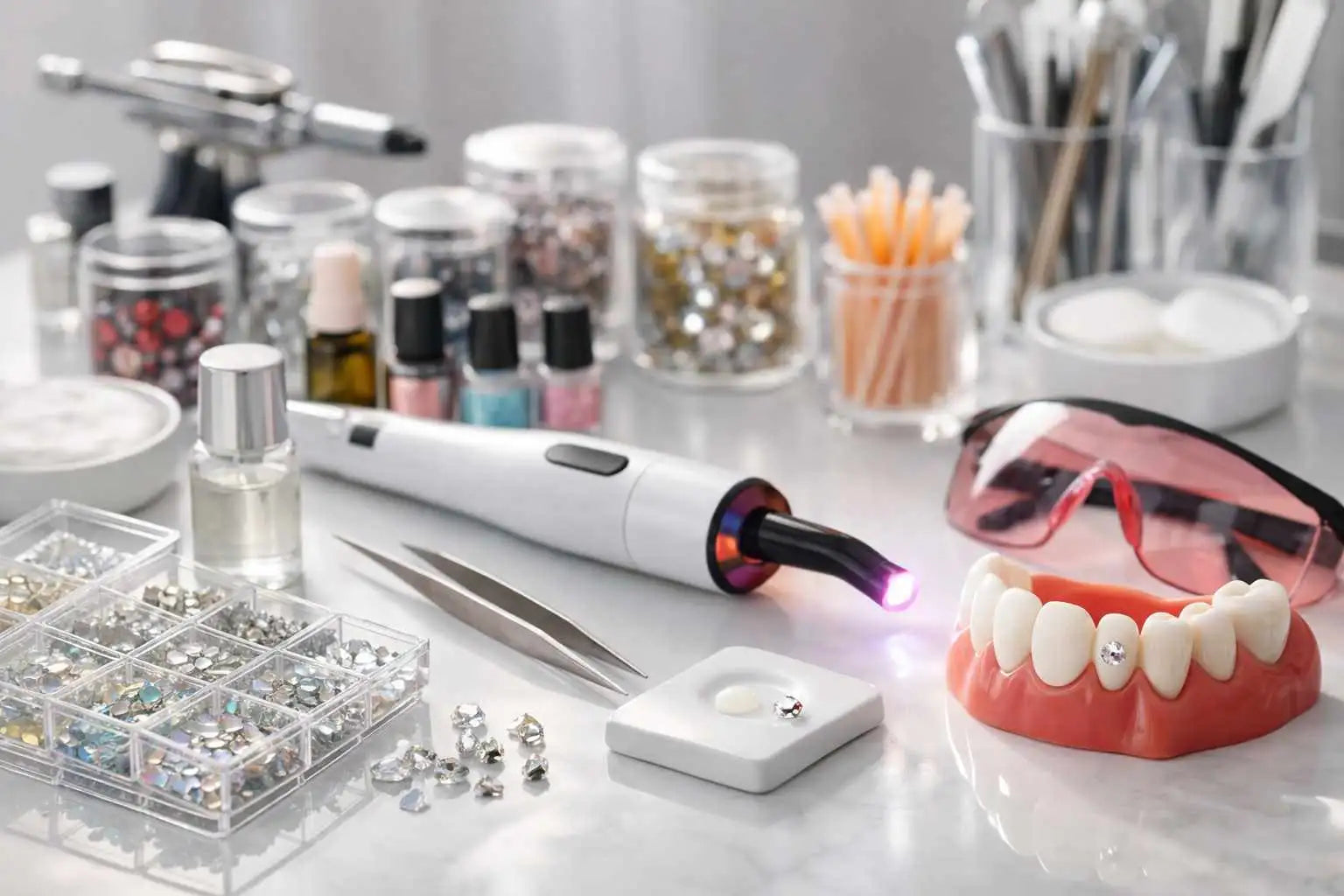
Creating signature designs for dental rhinestone application: inspiration and consistency

article pose signature

Quick answer: a signature design in dental rhinestone application relies on a clear logic: an identifiable style, a good choice of shapes, a visual hierarchy, harmonious placement, and true overall coherence. The goal isn't to add rhinestones randomly, but to create recognizable, elegant compositions tailored to the smile. The more consistent your artistic direction, the more premium, polished, and memorable your work will appear.

Summary

  • Why creating a signature design changes everything
  • Understanding the concept of visual consistency
  • Read the smile before designing a pattern
  • Choose a clear aesthetic universe
  • Working with shapes, sizes, and hierarchy
  • Composing with emptiness and rhythm
  • Find inspiration without copying
  • Create recognizable design families
  • Adapting the pose to the client without losing her style
  • Avoid messy compositions
  • Formalizing your method to gain consistency
  • Common mistakes
  • Checklist / tips
  • Recommendations
  • FAQ

Why creating a signature design changes everything

In the world of dental gems , many designs may look pretty at first, but few truly stand out. What distinguishes a simple decorative touch from truly memorable work is the ability to develop a consistent visual identity. A signature design acts like a fingerprint: it allows a client to recognize your style, an audience to identify you on social media, and your work to stand out in an increasingly visual market.

Creating a signature style doesn't mean repeating the same pose over and over. It means building a consistent aesthetic. Some photographers are instantly recognizable because they favor minimalist compositions, while others prefer celestial lines, constellations, romantic poses, or bolder designs. In all cases, consistency conveys an impression of mastery. It builds confidence and increases perceived value.

A client isn't just buying a rhinestone. She's choosing a world, a sensibility, a way to enhance her smile. The more consistent your work is, the clearer this promise becomes.

Understanding the concept of visual consistency

Visual consistency is the foundation of any successful signature design. It relies on several elements: the choice of shapes, the density of the composition, the logic of placement, the level of boldness, the balance between solid areas and open spaces, as well as how the eye reads the pose.

Without coherence, even beautiful rhinestones can create a confusing effect. Conversely, a very simple composition can appear high-end if it's carefully planned. This is what distinguishes an impromptu pose from a deliberate one. Coherence also allows you to tell a story. A soft, minimalist line doesn't convey the same feeling as a more fashionable, flashier, or bolder composition.

When we talk about coherence, we must think like we do in the world of jewelry, fashion, or makeup. A detail is never isolated. Each element interacts with the others. The beauty of a pose depends as much on what you include as on what you choose not to add.

Read the smile before designing a pattern

Before even considering style, you must observe the smile. This is an essential, often underestimated step. A composition may seem perfect on paper or based on a photograph, but lose all its impact if it doesn't reflect the actual dynamics of the client's smile. You need to look at which teeth are most visible, how the light naturally catches them, how the mouth opens, and how the smile changes when the person speaks or laughs.

Creating a beautiful dental rhinestone design isn't just about thinking about a pretty shape. It's about thinking in motion. A successful design should look harmonious in real life, not just in a still photograph. Some areas of the smile immediately draw attention, while others play a secondary role. An experienced professional learns to sense where to place the main focal point and where to create more subtle visual support.

This understanding of the smile helps avoid many mistakes. It allows you to avoid poses that are too off-center, unbalanced effects, or compositions that appear heavy when worn. Good design always begins with careful observation.

Choose a clear aesthetic universe

You can't create a strong brand signature without choosing a visual style. Trying to do everything at once often leads to a blurry result. It's therefore helpful to define a dominant aesthetic universe. For example, you could orient your style towards clean and luminous poses, glamorous compositions, romantic designs, graphic layouts, astrological inspirations, or more editorial creations.

This choice influences everything: the shapes you use most, how you combine them, the level of sophistication you seek, the image you project, and even the type of clientele you attract. A very minimalist style often appeals to customers who appreciate understated elegance, while a more demonstrative approach will appeal to those who want a true visual signature on their smile.

The most important thing is not to choose your style solely based on what's trendy. Trends can inform your thinking, but they shouldn't replace your artistic vision. A strong professional doesn't follow every fad: she filters, selects, and interprets.

Working with shapes, sizes, and hierarchy

The strength of a signature design often rests on a few simple yet decisive decisions. The first concerns shapes. Some immediately evoke an emotion or a mood. Stars suggest a more celestial feel, hearts a softer or more romantic feel, geometric shapes a more modern impression, while certain very subtle placements reinforce minimalist elegance.

The second important decision concerns size. A highly visible rhinestone draws the eye and naturally becomes the focal point of the composition. Smaller elements can then create rhythm, support the overall design, or complement the main shape. If everything has the same presence, the eye can get lost. If everything is too large, the composition becomes heavy. If everything is too small, the design may lack impact.

Therefore, you must think in terms of visual hierarchy. What is the focal point? What is the secondary accent? Where should the eye begin? Where should it rest? The clearer this hierarchy, the more controlled the result appears. Visual luxury often arises from this clarity.

Composing with emptiness and rhythm

One of the most common mistakes when applying dental gems is believing that the more elements there are, the more impressive the result will be. In reality, negative space is an aesthetic tool in its own right. Free space allows the design to breathe, highlights the main element, and avoids a cluttered look. An overly dense design loses clarity and elegance.

Visual rhythm is just as important. Two or three well-spaced elements can create a much more sophisticated effect than a clutter of details. The flow of the eye must be considered. The design should guide the eye smoothly. This sense of rhythm comes from the spacing between the elements, their distribution, their order of importance, and how they interact with the tooth.

In the most beautiful compositions, nothing seems forced. There is a sense of rhythm, a naturalness, a perfect tension between presence and lightness. It is precisely this feeling that must be sought in order to build a lasting visual signature.

Find inspiration without copying

Inspiration is essential, but copying weakens an identity. To create strong signature designs, you must learn to look beyond poses that have already been seen everywhere. Inspiration can come from fine jewelry, makeup lines, nail art, constellations, jewelry silhouettes, floral arrangements, fashion trends, the Y2K universe, or even more architectural references.

The key is not to reproduce a pose exactly, but to extract its underlying logic. Perhaps you like the way a composition leaves space around a central form. Perhaps you appreciate a certain balance between softness and structure. Perhaps you're drawn to very precise, almost editorial-style placements. From there, you can transform inspiration into a method.

This step is crucial because it allows you to move from passively consuming ideas to developing a true artistic direction. You are no longer simply reproducing an image. You are developing a visual style.

Create recognizable design families

To make your work more readable, it's helpful to build design families. This allows you to offer clear options while reinforcing your consistency. Instead of improvising at each meeting, you can work from broad creative guidelines that you then adapt.

For example, you can structure your universe into several categories: a very discreet line for minimalist poses, a constellation line for more aerial compositions, a romantic line centered on soft shapes, a graphic line for clean and modern placements, or a more assertive line for clients who want a more fashionable effect.

This organization has several advantages. It simplifies communication, facilitates the client's decision-making, improves the consistency of your visuals, and gives a much more professional impression. Your style becomes more identifiable because it is presented in coherent variations instead of being scattered.

Adapting the pose to the client without losing her style

Personalization is essential, but it shouldn't erase your identity. A skilled professional knows how to listen to the client without compromising their vision. This means being able to adapt the intensity level, the visibility of the design, the size of the elements, or the overall feel of the installation, all while maintaining your aesthetic principles.

For example, if your style is based on clean, bright, and never cluttered compositions, you can offer a softer or more impactful version depending on the client, but without going for a result that completely contradicts your image. Your role isn't just to execute. Your role is also to guide, advise, and edit.

This skillful adaptability strengthens your credibility. It demonstrates that you have a distinct style, but also an understanding of facial expressions, smiles, and expectations. It's often this blend of personality and attentiveness that fosters the strongest loyalty.

Avoid messy compositions

A messy composition rarely appears by chance. It often results from a lack of hierarchy, a poor mix of sizes, a jumble of ideas, a lack of breathing room, or poorly considered placement. Many poses lose their elegance not because the elements are bad, but because they are disorganized.

To avoid this, you need to learn to simplify. Whenever a design seems hesitant, it's often helpful to remove elements rather than add them. A strong main piece, well-supported, will almost always have more impact than a multitude of details without a clear direction. The eye likes to quickly understand what it sees. A confusing composition tires the eye and results in a less premium look.

It's also important to avoid mixing too many styles at once. A pose that's celestial, romantic, geometric, and maximalist all at the same time is unlikely to be coherent. Choose one dominant intention, then stick to that direction.

Formalizing your method to gain consistency

When a professional begins to develop a true style, it becomes useful to formalize her method. This can take the form of a pose library, an inspiration grid, a classification by design families, examples of balanced compositions, or a simple system allowing her to offer variations without starting from scratch.

This formalization greatly helps in maintaining a consistent standard. It also saves time, improves communication with clients, and strengthens your brand image. The clearer your method, the more stable, polished, and professional your work appears.

Creativity is not hindered by structure. On the contrary, it relies on it. When the foundations are solid, one can create with greater freedom, because one knows what works, what corresponds to one's world, and what truly enhances a smile.

Common mistakes

  • Trying to do too much from the very first composition idea.
  • Mixing several styles without a common thread.
  • Choosing a strong form without considering its accompaniment.
  • Neglecting the proportion between the tooth and the size of the rhinestone.
  • Copying a pose seen online without adapting it to the real smile.
  • Confusing creative asymmetry with visual imbalance.
  • To forget the importance of emptiness and breathing.
  • Increasing the details instead of clarifying the hierarchy.
  • Following all trends without building an identity.
  • Accepting requests that are inconsistent with one's visual positioning.

Checklist / tips

  • Define a main aesthetic universe before composing.
  • Observe the actual smile before choosing the placement.
  • Identify a clear focal point in each design.
  • Working with a simple hierarchy: centerpiece, accent, breath.
  • Limit the number of styles mixed in the same pose.
  • Create reusable and consistent design families.
  • Prefer a clean composition to an overly busy one.
  • Maintain consistent visual references from one pose to the next.
  • Guiding the client towards a harmonious result rather than following a confused desire.
  • Always think in terms of the final result and not in terms of adding separate elements.

Recommendations

FAQ

What is a signature design in dental rhinestones?

A signature design is a recognizable way of composing poses through recurring choices of shapes, placement, density, hierarchy, and overall style.

Why is visual consistency so important?

Because it conveys an impression of control, enhances perceived value, and makes your work more easily identifiable. A consistent pose looks cleaner, more premium, and more professional.

How to find your own style?

By observing what visually attracts you, identifying the shapes and rhythms you naturally use, and then intentionally repeating certain codes until you create a true continuity.

Do we need to follow trends to be attractive?

Trends can be useful for sparking inspiration, but they shouldn't replace your own identity. The most effective approach is to filter trends according to your own style.

How to avoid a cheap look?

By working on proportion, hierarchy, breathing, and overall coherence, a simple but well-thought-out pose often appears more high-end than an overloaded one.

Is it possible to personalize without losing one's signature style?

Yes, provided you retain your core elements. You can adapt the intensity, size, or feel of the design while maintaining your visual DNA.

Why do some seemingly simple poses leave a greater impression?

Because they are legible, balanced, and precisely conceived. The impact depends not only on the number of elements, but also on the accuracy of the composition.

What is the SEO angle of this article?

The main angle is inspirational and strategic: to help build a visual signature in dental rhinestone application without directly competing with transactional purchase-oriented pages.

SEO angle chosen

Recommended main keyword: signature design dental rhinestone application

Intention: inspirational, creative and strategic, centered on visual consistency, aesthetic identity and the construction of a recognizable posing style.

H1 alternative in case of cannibalization risk: How to build a visual signature in dental rhinestone application

Alternative angle: methodology for creating a consistent style of dental rhinestone applications without turning the page into transactional content.

Leave a comment

This site is protected by hCaptcha and the hCaptcha Privacy Policy and Terms of Service apply.

Reading next

Stratégie de réassort pour gems tech : passer du pack au stock